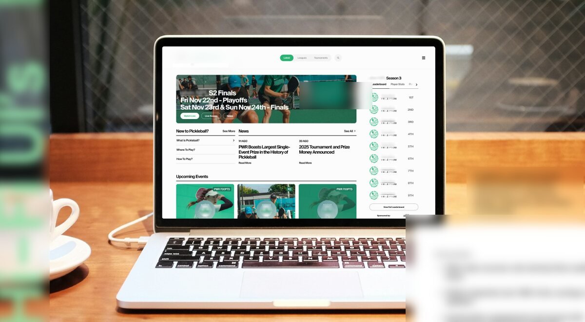
Engagement increase (session time)
Task-success rate in testing
Mobile usability uplift
Less admin time, via new CMS
A template site that had run out of room to grow.
Background. The organisation ran on an aging template-based website. It worked, but poor usability, inefficient data management, and limited scalability were quietly capping the organisation's growth.
Content updates required manual effort with no structured CMS. Members couldn't easily find match results or team updates. And the mobile experience, where most people actually were, was cluttered and inconsistent.
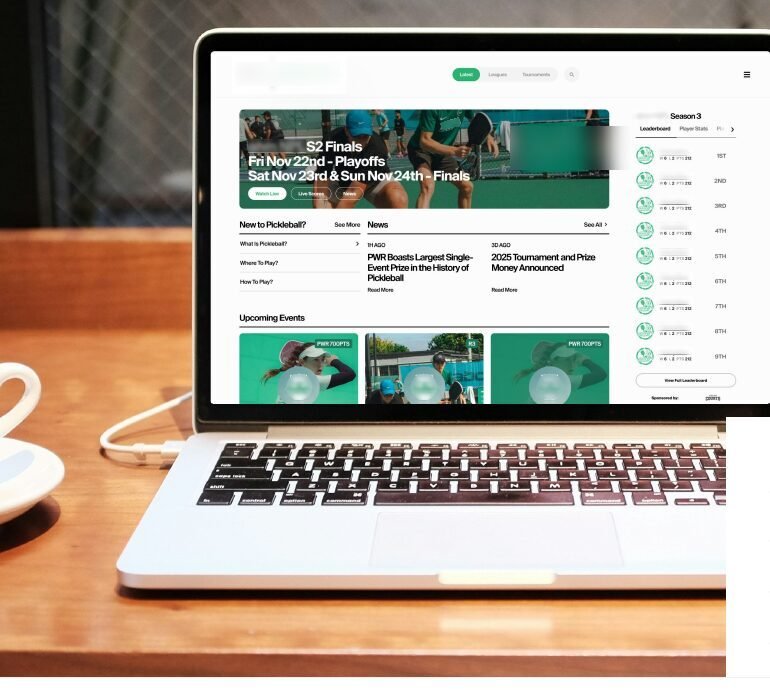
Turn a static, unscalable template into a dynamic digital hub for the community, where members find what they need in seconds and admins stop fighting the CMS.
The Opportunity
Improve usability and simplify navigation.
Implement a scalable design system.
Make sports data, results, schedules, venues, easily available to users.
Reduce manual content-management tasks.
Eight weeks, research-led, five rounds of testing, structured around real jobs-to-be-done.
Redesign the platform from the ground up so it scales with the organisation, improving user experience, visual design, and backend efficiency together.
Hard to navigate. The template site was visually outdated and difficult to move through.
Manual everything. Content updates required manual effort and lacked a structured CMS.
Information buried. Users couldn't find match results or team updates easily.
Cluttered on mobile. The mobile experience, where most users were, felt inconsistent.
No structured onboarding. Newcomers had no clear path in, from beginner to competitive player.
UX & UI Designer, end to end.
From research to high-fidelity handoff, We led the redesign across administrators, coaches, and members, restructuring the product around the jobs people were actually trying to do.
- Ran user research across administrators, coaches, and members.
- Mapped key journeys to uncover friction in navigation, information retrieval, and admin workflows.
- Restructured the information architecture around real jobs-to-be-done.
- Designed a new onboarding, navigation, and home screen.
- Built a scalable design system for consistency at scale.
- Ran five rounds of usability testing and delivered hi-fi UI + prototype for handoff.
Research to a living product, in five moves.
User Research
Mapped key journeys for every user type to uncover friction in navigation, information retrieval, and admin workflows, grounding the redesign in real behaviour, not assumptions.
IA & Personas
Defined four primary personas and restructured the information architecture around what people were actually trying to do.
- Discover & join local games, events, and leagues.
- Reliable info on rules, venues, and schedules.
- Track progress and connect with other players.
- No centralised, trustworthy information.
- Difficulty scheduling or finding nearby events.
- Unstructured onboarding for newcomers.
- A unified dashboard: locator, scheduling, events, community.
- Tailored onboarding and smart filters.
- A fast, mobile-first experience.
Wireframes
Initial wireframes focused on streamlined navigation, prioritised content hierarchy, and clear calls to action for each user type.
Structure validated before visual design, de-risking the build early.
Prototype & Testing
A mid-to-high-fidelity prototype simulated the redesigned experience across four primary personas, tested over five rounds with real users.
- Responsive homepage navigation and quick access.
- Court locator with smart filters.
- Player dashboard and performance tracking.
- Community forum and event registration.
Task success in testing
Mobile usability uplift
Real users across 5 rounds
Hi-Fi UI & Impact
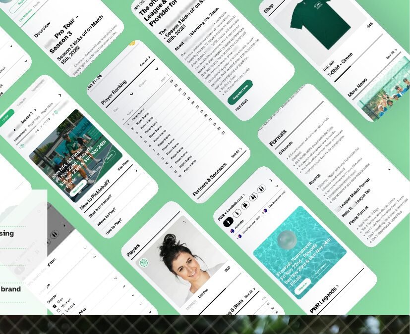
Designs evolved on feedback, modular components, mobile responsiveness, and visual energy aligned with the sports brand, then shipped as desktop and mobile hi-fi UI.
95% task-success in final testing, the client reported 50%+ time savings on updates, and community engagement rose with improved access and mobile UX.
Goals set, and beaten.
| KPI | Goal | Result |
|---|---|---|
| User engagement | +50% | +60% (session time) |
| Admin update time | −40% | −55% (via CMS) |
| Mobile usability | +60% | +72% (usability test) |
| Task completion | +90% | 95% success rate |
From wireframes to a living product.
Evolved designs based on feedback, modular components, mobile responsiveness, and visual energy aligned with the sports brand, across a full mobile UI set and desktop hi-fidelity screens.
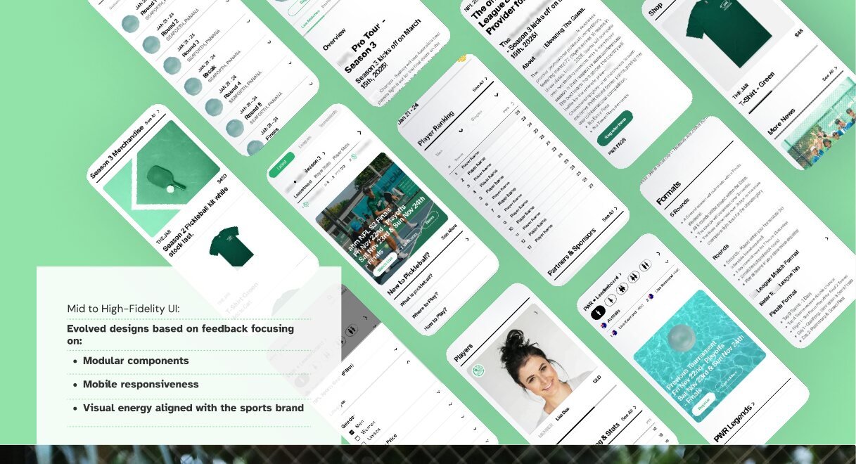
Designing for sport, driven by people.
Static to scalable. A rewarding shift from an unscalable platform to a dynamic digital hub for the community.
Clarity wins. Top user feedback: “The homepage feels clean and not overwhelming.”
Mobile-first pays off. Most engagement happened on mobile, so that's where the experience had to shine.