
Task completion in prototype testing
Booking-flow clarity rating
Users confident using it regularly
Would recommend to peers
An industry ready to go digital, with nothing to book on.
Background. A fragmented, largely offline equestrian industry relied on manual, word-of-mouth discovery to connect riders with trainers, vets, farriers, and event organisers. There was no centralised way to find and book trusted providers.
The founder had a strong hypothesis and a clear market. But two-sided marketplaces are expensive to build, and expensive to get wrong. The riskiest question wasn't the technology; it was adoption.

How might we integrate a fragmented equestrian community onto a single, interactive platform, connecting riders with trusted service providers?
The Design Challenge
Let equestrians discover and book trusted service providers.
Manage schedules and payments in one place.
Track horse profiles and training.
Access local and national events.
Lead with validation, test the riskiest assumptions on a real prototype before committing to a build.
De-risk a two-sided marketplace before build, proving that riders and providers would adopt it, and that the core booking journey was clear enough to trust.
No centralised services. Riders and horse owners had nowhere single to look.
Manual, offline discovery. Finding a provider meant word-of-mouth and phone calls.
Missed opportunities. Bookings, events, and training were falling through the cracks.
Fragmented workflows. Scheduling, payments, and communication lived in separate places.
Ready, but resistant. An industry open to digital transformation, if the first experience earned its trust.
UX & UI Designer, validation lead.
Framed the riskiest assumptions for a two-sided marketplace, then designed and tested a working prototype with real equestrian professionals to prove the concept before build.
- Framed the riskiest assumptions for a two-sided marketplace.
- Mapped personas, stakeholders, and end-to-end journeys, search, profile, scheduling, payments, events, feedback.
- Ran Crazy 8s ideation and simplified the core booking flow.
- Built an interactive Figma prototype for testing.
- Tested with trainers, instructors, and coaches; captured quant + qualitative feedback.
- Translated feedback into layout, language, and flow improvements.
From risky assumption to validated build plan.
Discover & Define
Framed the market and the single riskiest assumption, would providers and riders actually adopt one platform? Mapped personas, stakeholders, and journeys.
- Find and book trusted providers.
- Manage schedules and payments.
- Track horse profiles and training.
- Be discoverable to nearby riders.
- Streamlined scheduling and bookings.
- Payment visibility and clear communication.
- Resistant, but ready for digital.
- No trusted central source.
- Cultural context matters as much as features.
The real risk was adoption and booking-flow clarity, not technology.
Ideation & Co-Creation
Crazy 8s sketching and MVP UI mapping, converging on a focused concept centred on the core booking journey.
- Streamlined scheduling and booking.
- Integrated payment management.
- Effective communication tools between riders and providers.
A concept sharp enough to prototype, built around the one journey that mattered most.
Wireframes
Low- to mid-fidelity wireframes in Figma, simplified booking, calendar views, and user onboarding.
Structure validated before any visual polish, keeping the sprint fast and cheap.
Prototype & Testing
An interactive Figma prototype was tested with trainers, instructors, and coaches, using SurveyMonkey for quantitative signal and Miro for a live feedback grid.
- Most users rated usability above 4 out of 5.
- Booking and scheduling tasks completed successfully.
- Feature suggestions were minor, mostly UI clarity.
- Willingness to adopt was high among participants.
Completed all tasks
Booking-flow clarity
Profile setup ease
Refine & Decide
Post-test actions turned feedback into a prioritised build plan.
- Added more labels and onboarding prompts.
- Reorganised the bottom nav bar for clearer hierarchy.
- Introduced role-based dashboard customisation.
A validated, prioritised build plan, the marketplace de-risked before development began.
What the prototype proved.
| Signal | Result |
|---|---|
| Task completion rate | 83% completed all tasks |
| Booking-flow clarity (1–5) | 4.2 average rating |
| Profile setup ease (1–5) | 4.0 average rating |
| Confidence using it regularly | 5 of 6 said “Yes” |
| Willingness to recommend | 4 of 6 would recommend |
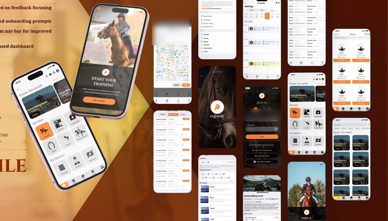
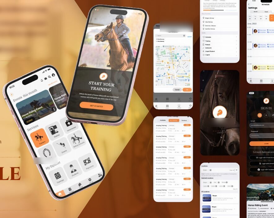
A mobile-first ecosystem, validated.
A sleek, intuitive mobile interface designed to streamline booking, scheduling, and equestrian service access on the go, alongside a web experience for discovery and provider profiles.
What this project taught us.
Design for underserved industries. The biggest opportunities are often where digital hasn't reached yet.
Combine strategy with cultural context. A resistant-but-ready industry needed trust, not just features.
Build user-first, for real-world impact. Validation kept the product honest before a line of code was written.